
In this tutorial, you’ll learn how to create a very fancy “Web 2.0″ website layout in Adobe Photoshop using beginners skills. If you have any questions about this tutorial don’t hesitate to ask in the comments
Here is what you’re going to create in this tutorial:

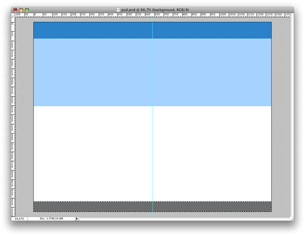
1 - Create a new document of 1280*1024 pixels. Fill the background with white (#FFFFFF)
2 - Pick up the rectangular marquee tool and draw a rectangle with a height of 455 pixels. That will be our website featured content. Fill it with light blue (#B3DDFB).
Once done, draw a new rectangle from the top of the document to be our website header. In the example, mine have a height of 89 pixels and the color is #3399CC.
Last part is to do the footer. Just draw a rectangle on the bottom of the document and fill it with grey (#7E8081)
You will have something like this:
3 - A site can’t be great without a great navigation. So let’s draw a cool tab-based navigation for our new design. Create a new layer set and name it navigation.
Pick up the rounded rectangle tool, set the radius to 10px and draw a rounded rectangle to be a menu tab. Background color should be the same as our featured content background (#B3DDFB). On the layers window, right click on the newly created layer and choose “Rasterize layer” from the menu.

4 - Copy the layer 3 times in order to have 4 tabs. Place the navigation layer set a 30 pixels of the right margin of the document, as shown in screenshot below.

5 - Now, let’s create a different style for the active tab. With the rounded rectangle tool, create the same rounded rectangle as before, but with white (#FFFFFF) as background color.

6 - Once the active tab layer is created, right click on it on the layers windows and select “Blending options” from the dropdown menu. Add a gradient with the following parameters:

Your navigation should now look like this:

7 - Let’s add some text to the tabs. I have choosen a 24pt, “Arial rounded” font with #3399CC as color. We now have a finished menu:

8 - The next step is to create the 3 numbered steps describing how cool the product is. Create a new layer set and call it “Numbers”.
9 - Now, pick up the Elipse tool and draw a circle, with white (#FFFFFF) background. Once done, pick up the text tool, and write two lines of text. In the PSD, I have used 24pt #3399CC Arial Rounded font.
10 - Keep the Arial Rounded font and change its size to 60pts. Type “1″ in the whote circle.
11 - Repeat steps 8, 9 and 10 until you have 3 differents numbered steps. At this point, it should looks like this:

12 - Time to add a video presentation of the product. I have simply took a screenshot of a vimeo video, and scaled it to 401*289 pixels.

13 - Now that we completed the upper part of our design, let’s populate the main part of our design, which will be where our product presentation text will go. Create a new layer set named “Paragraph 1″.
14 - Pick up the text tool and write the paraph title. I have choosen Arial Rounded font, 24pt, in #7E8081 color.
15 - Pick up the line tool and draw a line below the paragraph title. Color is the same as for the title, #7E8081.
16 - Let’s write the paragraph: Pick up the text tool and draw a square to write in. The square should have the same width as the line we previously drawn.
17 - Once you typed your paragraph text, select it and open up the Character and Paragraph palette. Click on the “Paragraph” tab in the palette, and click on the “Justify All” button to justify your text.

18 - For the two remaining paragraphs, simply copy the layer set named “Paragraph 1″, or repeat the last 4 steps. Once you completed this step, the paragraphs will look like this:

19 - We now have a design that starts to looks very good. Though, two important part are missing, the footer and the logo. let’s start by the logo. Place the cursor in the header and type your web 2.0 app name. I chose “WidgetCreator”, which sound really cheesy web 2.0, but of course, feel free to find a better name
20 - For the logo icon, I have picked up this image.

21 - Last step of this tutorial is the footer. Siply choose a white (#FFFFFF), 18pt Arial font and type your text. Make sure to align it to the center of the page.

Another idea for a great footer should have been to add sponsors logos. Feel free to experiment!
And here is our final result:
The proof that you can easily create a very fancy design with nothing more than beginner skills in Photoshop!